ScienceIO
Overview
ScienceIO leverages machine learning to automate data processing and analysis for healthcare organizations. The platform can extract insights from complex datasets, such as electronic health records (EHRs) and medical imaging, to help providers make more informed decisions about patient care.
My Role
At ScienceIO I worked with a small team of talented developers, and illustrators to redesign ScienceIO's customer facing website and brand identity. We handed off a new design system, as well as a fully customizable website built with Contentful and Jamstack.
Distilling The Problem
ScienceIO asked us to make their identity approachable to users, and make their tech stack accessible to their marketing team.

Previous website
The existing website was minimal, clean, and technology-focused. However, it lacked an overall sense of humanity. We aimed to blend people and AI by focusing on the value ScienceIO brings to its users and the industry at large.
- Defining the brand identity. Before diving into design, I focused on understanding the desired user experience. Conducting stakeholder interviews allowed me to grasp how the brand wished to be perceived, laying the groundwork for an original and engaging website.
- Building a design system With clear design goals in mind, I distilled the insights from the interviews into a cohesive design system. This included establishing a color palette, selecting typography, and creating scalable components to ensure consistency and flexibility across the site.
- Developer handoff To enhance the marketing team efficiency, we transitioned to a new headless CMS, Contentful. By applying Atomic Design principles in my Figma files, I ensured a smooth developer handoff. This approach provided consistent style guides and modular components, facilitating seamless integration and future updates.
Reimagining The Outcome
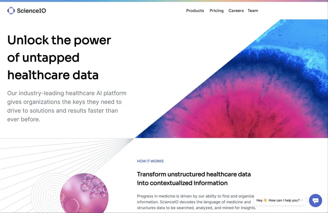
We explored concepts and competitors to distill the value ScienceIO provides both visually and verbally. By incorporating beautiful illustrations representing the connection between patients and their data, users are immediately drawn to learn more.

By incorporating organic shapes and simplifying the color palette we were able to achieve an inviting environment with a human feel. We also added CTAs to increase user conversion by giving them a clearly defined next step.
- Organic shapes & illustration By incorporating organic shapes and custom illustrations, we aimed to evoke warmth and accessibility. This design approach helped in making the website feel more inviting and personable, setting a positive tone for users from the moment they arrived.
- Layout & Guidelines We simplified the color scheme, selected cohesive typography, and built comprehensive layout guidelines. This approach significantly improved consistency across the user experience, creating a more unified and engaging interface.
- Marketing CMS We developed a user-friendly CMS editor. This tool enables the marketing team to effortlessly modify website content and create new pages. By empowering them with greater control, we ensured the website remains dynamic and up-to-date without requiring technical expertise. We provided comprehensive documentation to further streamline the process. View the documentation here.
Relevant Data
Success was more than just visual upgrades. Here is what the data said.
- Product Page Performance
- 3x Faster
- Increased web.dev performance from 24 to 99.
- Pricing Page Accessiblity
- 50% Increase
- Increased web.dev accessibility rating from 71 to 100.
- Conversion Rate
- 10% increase
- Performance improvements resulted in more user conversions.
Image Gallery

ScienceIO Home Page

ScienceIO Product Page

ScienceIO Company Page

ScienceIO Blog Page